The Importance of Color Psychology in Graphic Design
Discover how color psychology impacts graphic design. Learn to use colors strategically to influence emotions, enhance user experience, and strengthen branding. Elevate your designs and captivate your audience with expert tips on color psychology for marketing and design success.
The Importance of Color Psychology in Graphic Design
Color plays a vital role in graphic design, shaping how audiences perceive and interact with visual content. Understanding the psychological effects of colors can elevate a designer’s ability to communicate effectively, influence emotions, and drive desired actions. This blog explores the importance of color psychology in graphic design, highlighting its role in branding, user experience, and marketing.
What is Color Psychology?
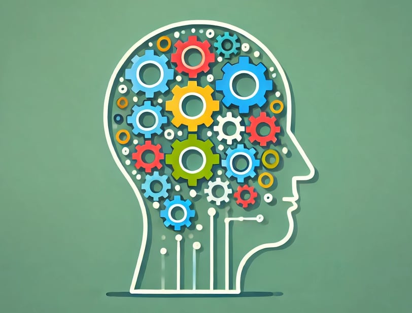
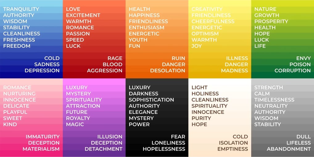
Color psychology is the study of how colors influence human behavior, emotions, and perceptions. Different colors evoke specific feelings and associations, often rooted in cultural, social, and personal experiences. For example:
Red: Associated with energy, passion, and urgency, often used in sales promotions.
Blue: Conveys trust, calmness, and reliability, making it popular among corporate brands.
Yellow: Represents optimism, warmth, and creativity, used to attract attention.
Green: Linked to nature, health, and growth, often found in eco-friendly branding.
Designers leverage these associations to craft visuals that resonate with their target audience.


The Role of Color in Branding
In branding, colors are integral to creating a strong identity and fostering recognition. Brands use specific color schemes to:
Establish Identity: Consistent use of colors helps brands stand out in a competitive market. For instance, Coca-Cola’s red is instantly recognizable worldwide.
Convey Values: Colors communicate brand values and personality. A luxury brand might use black to symbolize sophistication, while a tech company might opt for blue to signify innovation and trust.
Evoke Emotion: Effective branding taps into emotions. For example, a charity organization might use warm colors like red and orange to evoke empathy.
Enhancing User Experience with Color
Color choices significantly impact user experience (UX) by guiding navigation, highlighting important elements, and creating a cohesive aesthetic. Key considerations include:
Readability: Ensuring text contrasts well with background colors to enhance legibility.
Hierarchy: Using color to prioritize information, such as call-to-action buttons in bold hues like orange or red.
Mood Setting: Choosing colors that align with the desired emotional tone of a design. For example, a meditation app might use soft blues and greens to create a calming effect.
The Impact of Color on Marketing and Advertising
In marketing, colors influence purchasing decisions and brand perception. Studies suggest that:
Color Increases Brand Recognition: Consistent color use can improve brand recognition by up to 80%.
Color Affects Purchase Behavior: Certain colors trigger specific actions. For example, red can create a sense of urgency, making it effective for clearance sales.
Color Creates Visual Appeal: Attractive color combinations capture attention and enhance the appeal of advertisements, packaging, and digital content.
Cultural and Contextual Considerations
While color psychology provides general guidelines, designers must account for cultural and contextual differences. A color’s meaning can vary across cultures:
White: Symbolizes purity in Western cultures but may signify mourning in some Asian cultures.
Red: Represents good luck in China but can signal danger in Western contexts.
Understanding the target audience’s cultural background ensures the message is interpreted as intended.
Conclusion
Color psychology is a powerful tool in graphic design, influencing emotions, perceptions, and actions. By understanding the psychological impact of colors and tailoring designs to audience preferences, designers can create compelling visuals that leave a lasting impression. Whether in branding, user experience, or marketing, thoughtful color choices are key to effective communication and successful design outcomes.
where creativity meets strategy to bring your brand’s vision to life.
contact@saadgraph.com
+212 621-423-049
© 2024. All rights reserved.
Contact
Social